A brand system built around energy
An interactive version of the guidelines: logo, typography, colors, pattern, triangular shape and corporate materials.
Logo
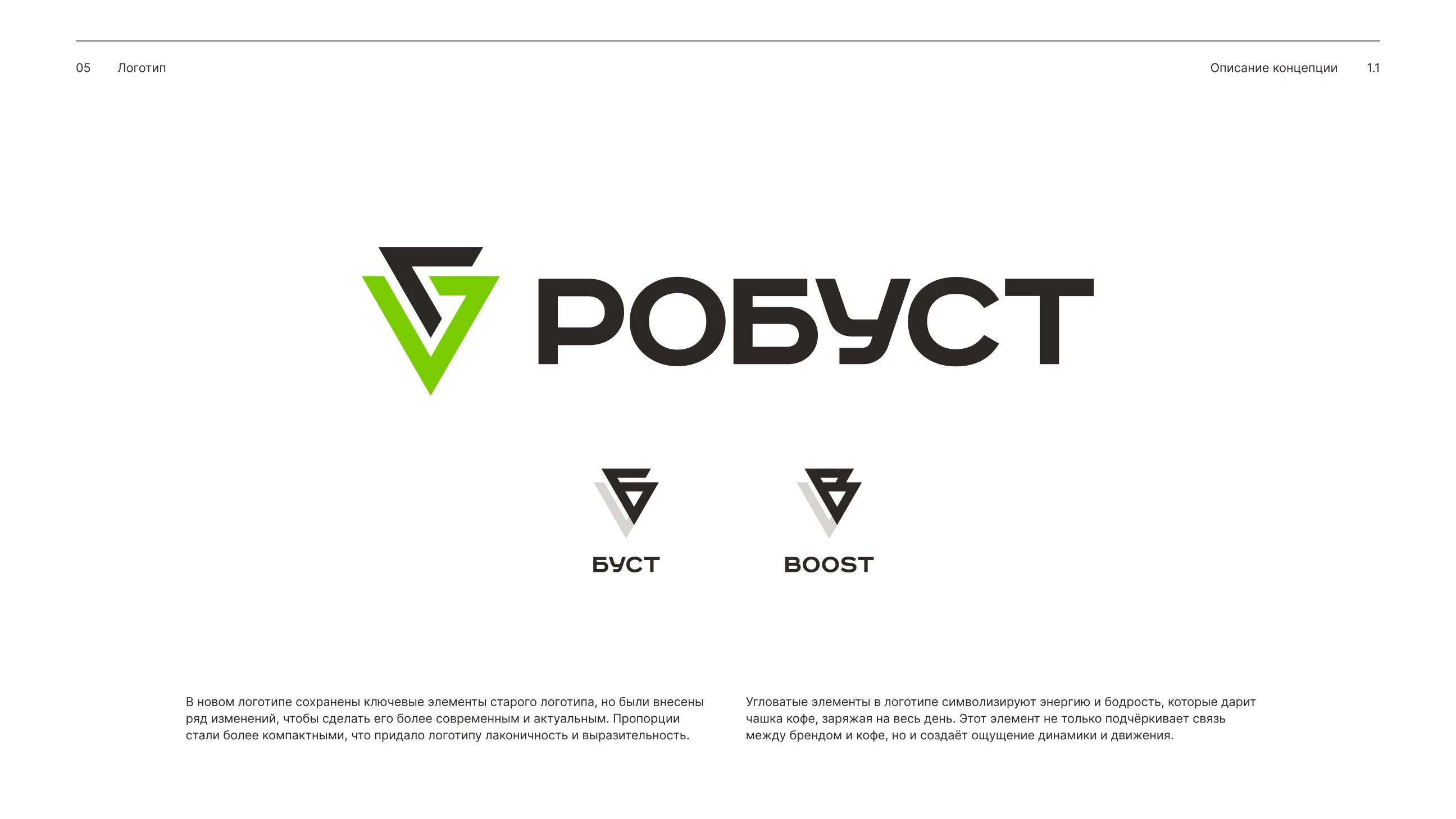
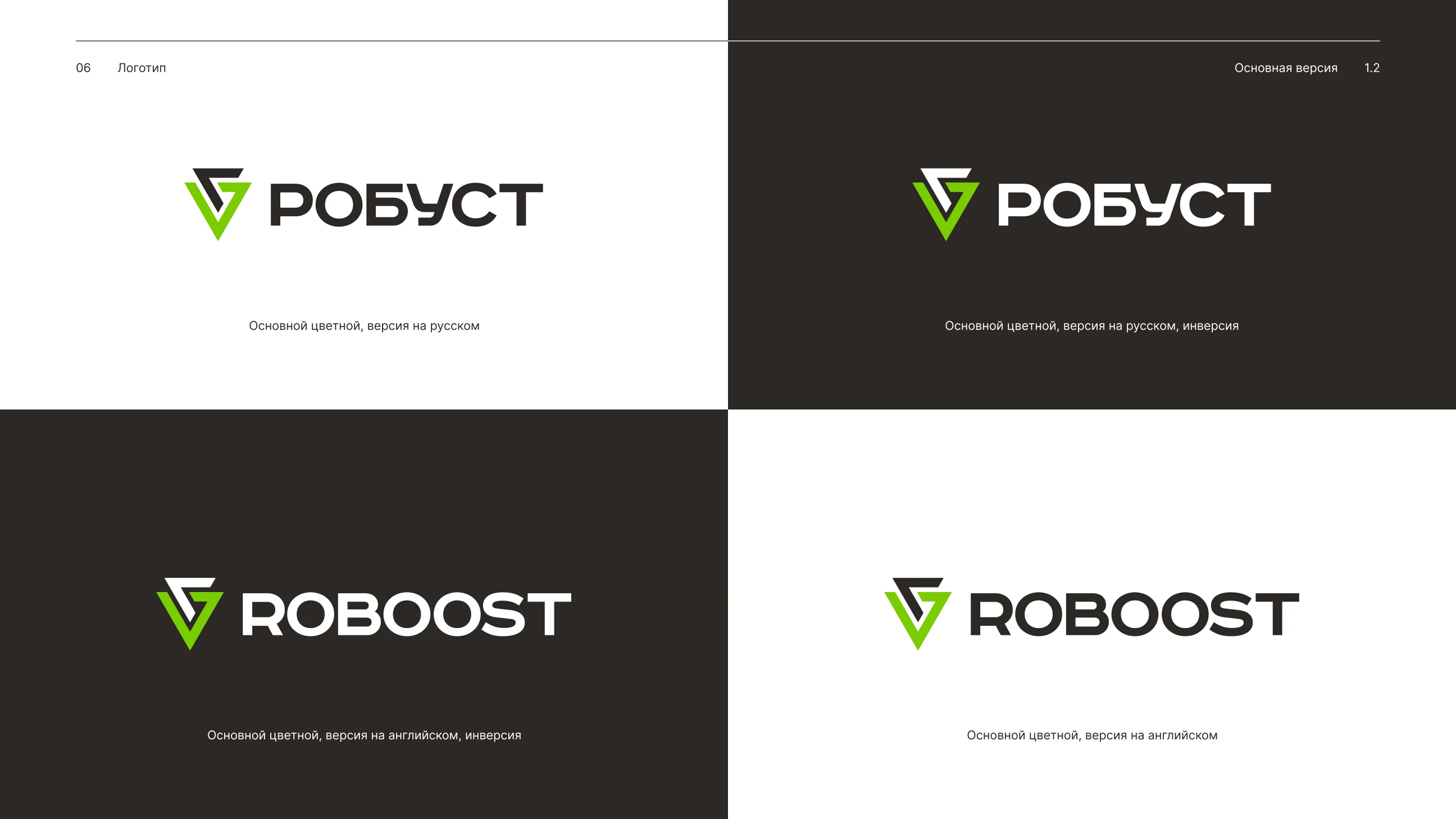
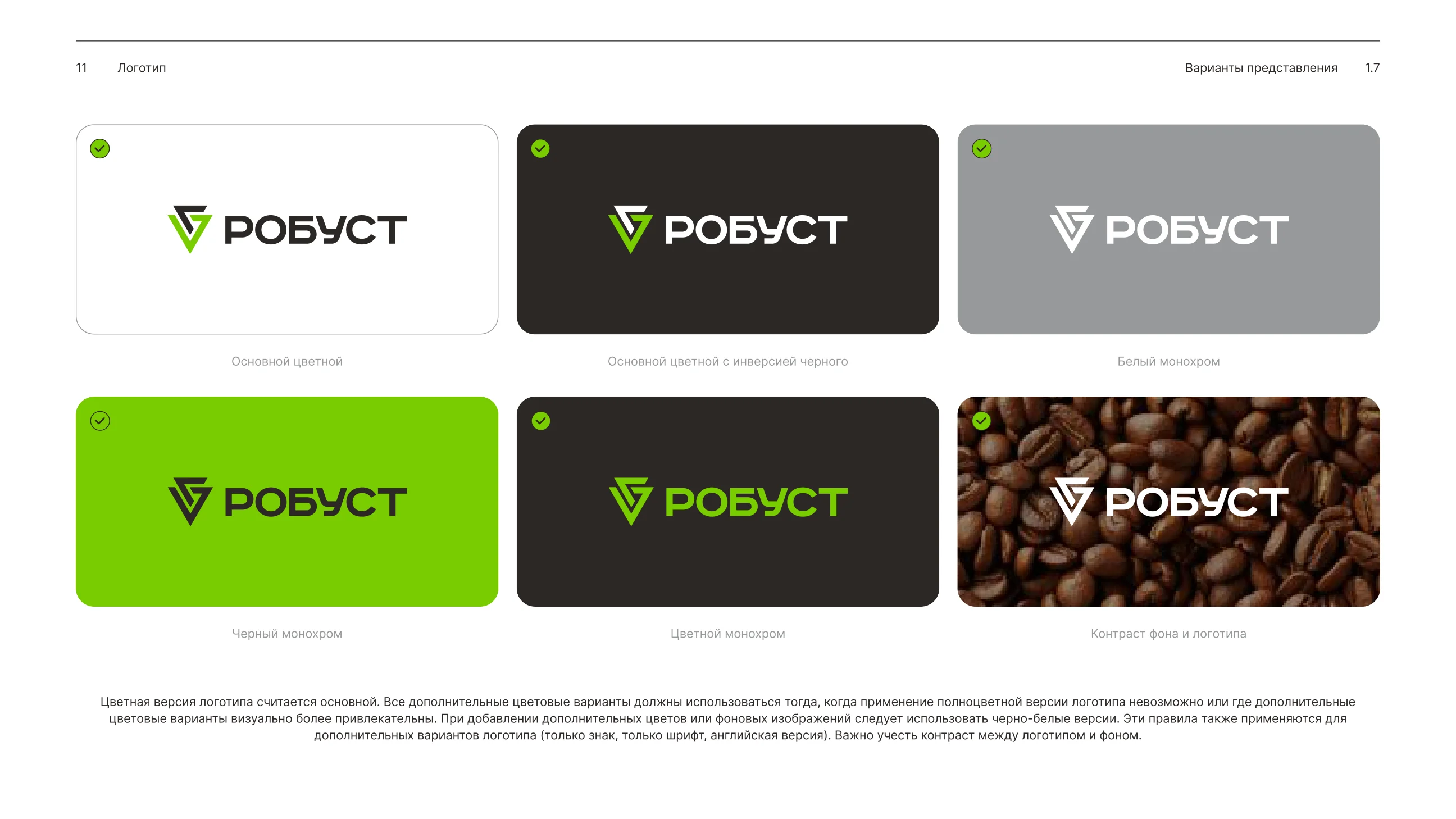
The mark is based on angular movement and two equilateral triangles. The primary logo remains full-color, while alternate versions are used when they improve readability.

The clear space is built from the X size around the mark and wordmark.
Use
- checkKeep proportions
- checkMaintain background contrast
- checkChoose the right logo for the medium
Avoid
- closeStretch the mark
- closeRecolor individual elements
- closeAdd shadows or effects
Typography
RoadRadio carries headlines and navigation. Inter is used for long-form text, descriptions and interface details.
Your perfect coffee
Try a taste that inspires.
Coffee: a drink that inspires
Coffee is not just a drink, but a world of flavors and aromas. It can wake the senses, charge energy and create a moment of attention.
Palette
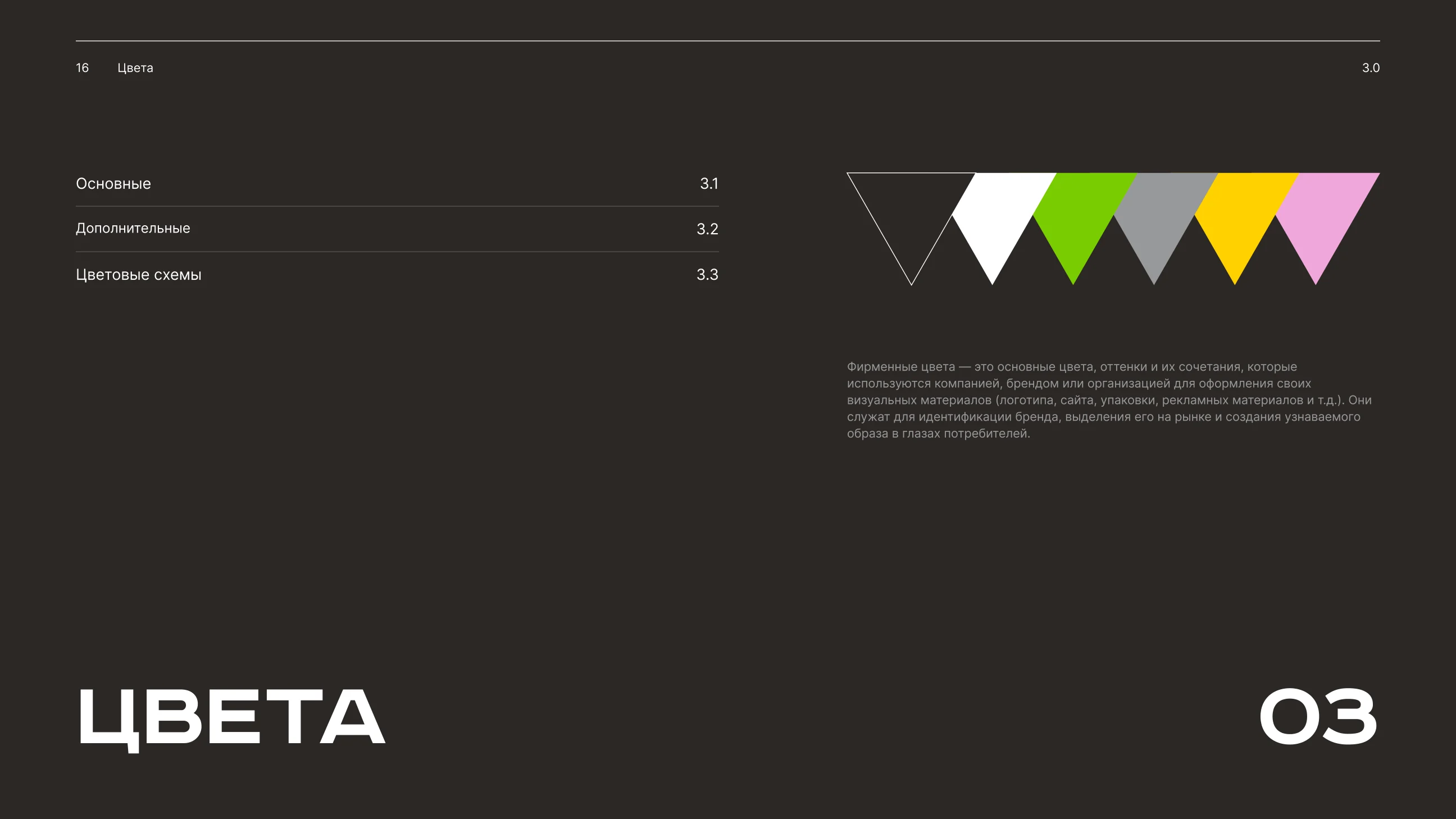
The core set is white, black and green. Gray, yellow and pink work as supporting accents in graphics and communications.
Pattern & Shape
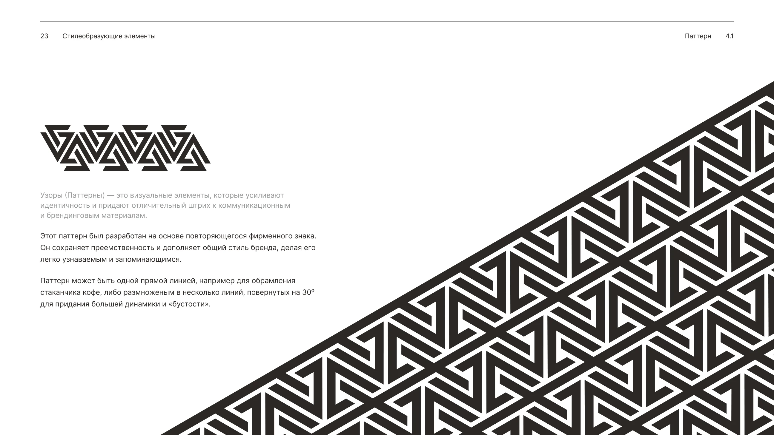
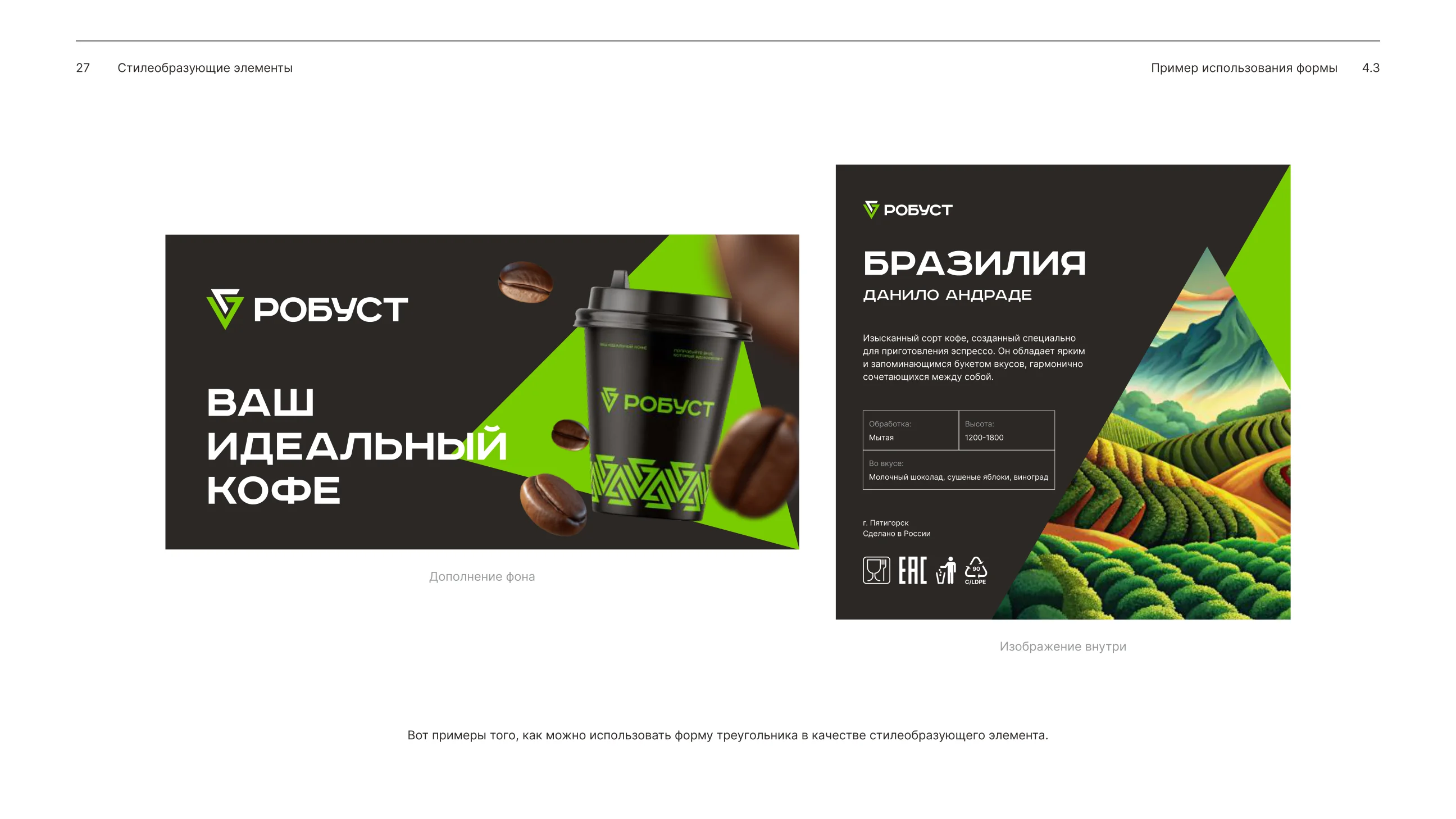
The pattern is assembled from the repeating brand mark. The triangle can work as a background, image container or bold graphic accent.
Rhythm that holds the surface
The pattern should work as part of packaging or background, without fighting the logo and text.
Brand in Use
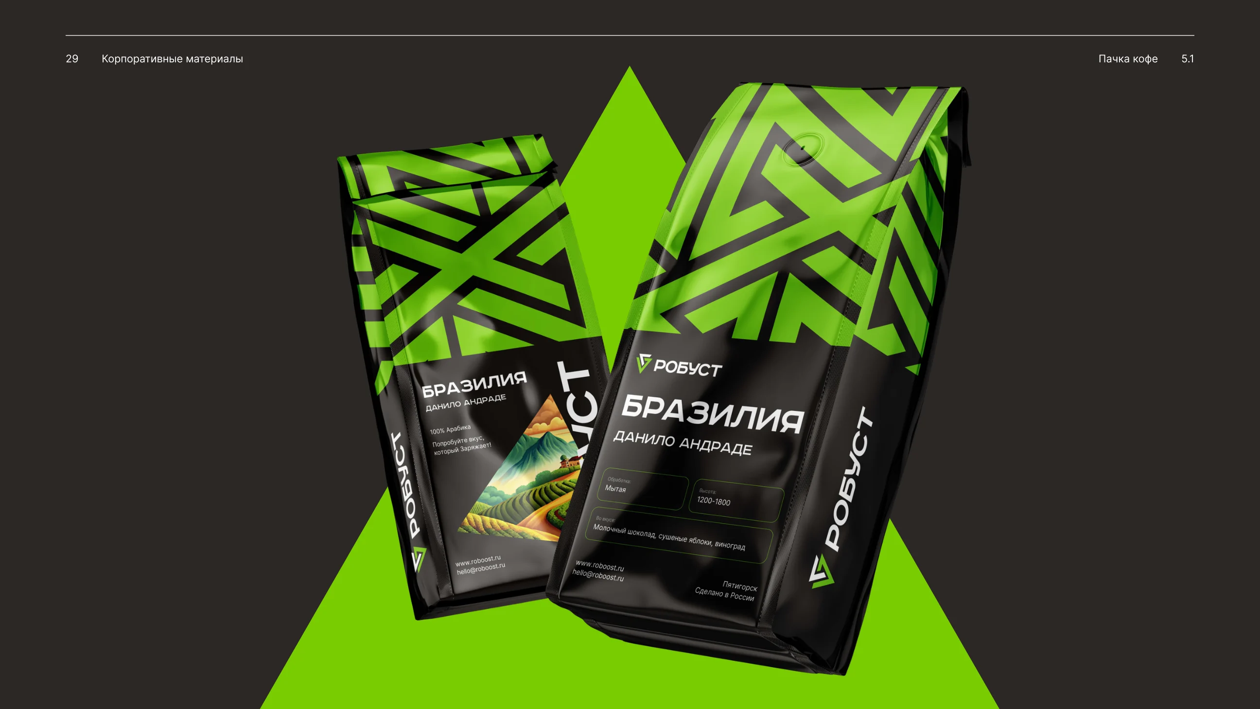
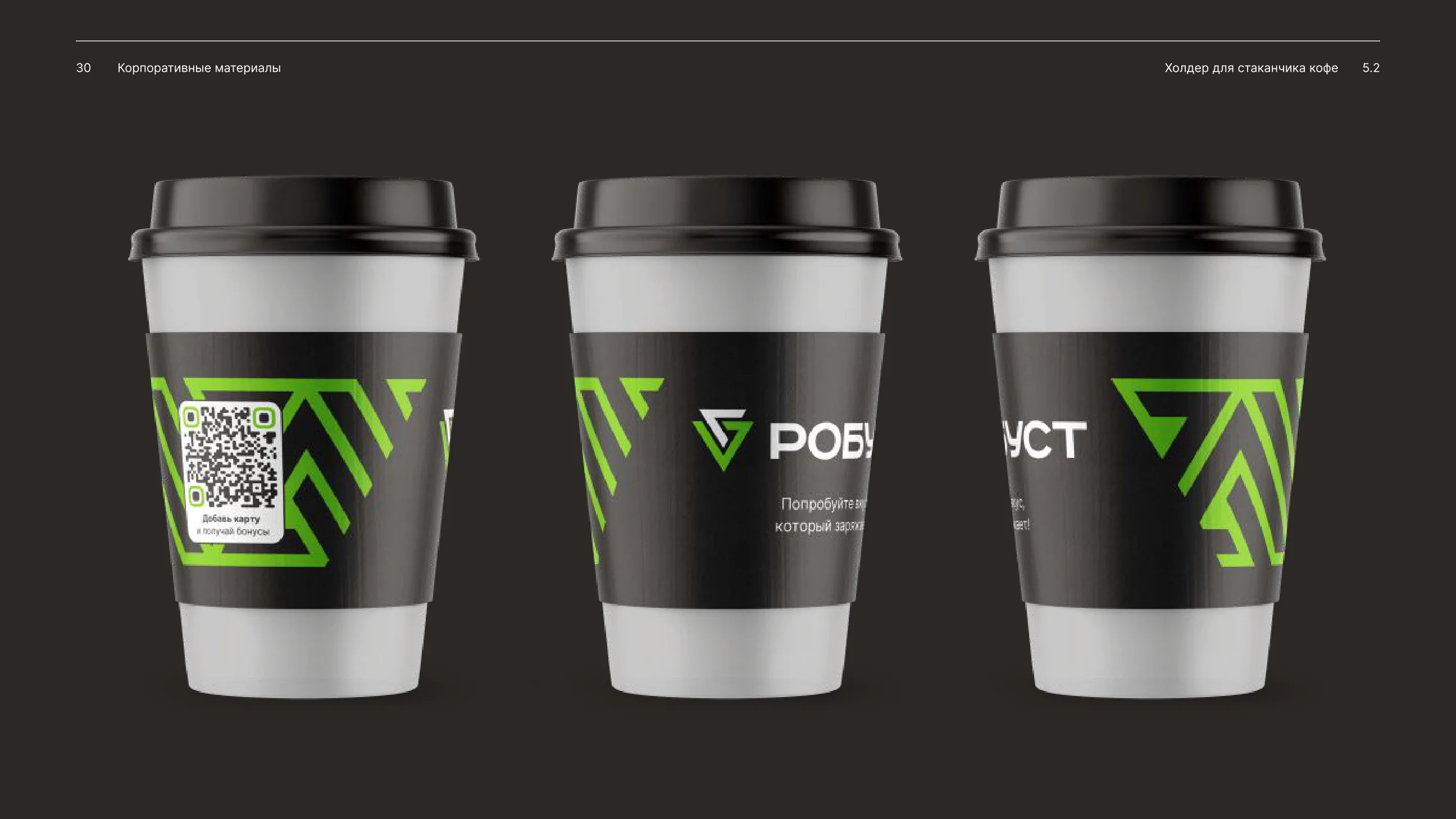
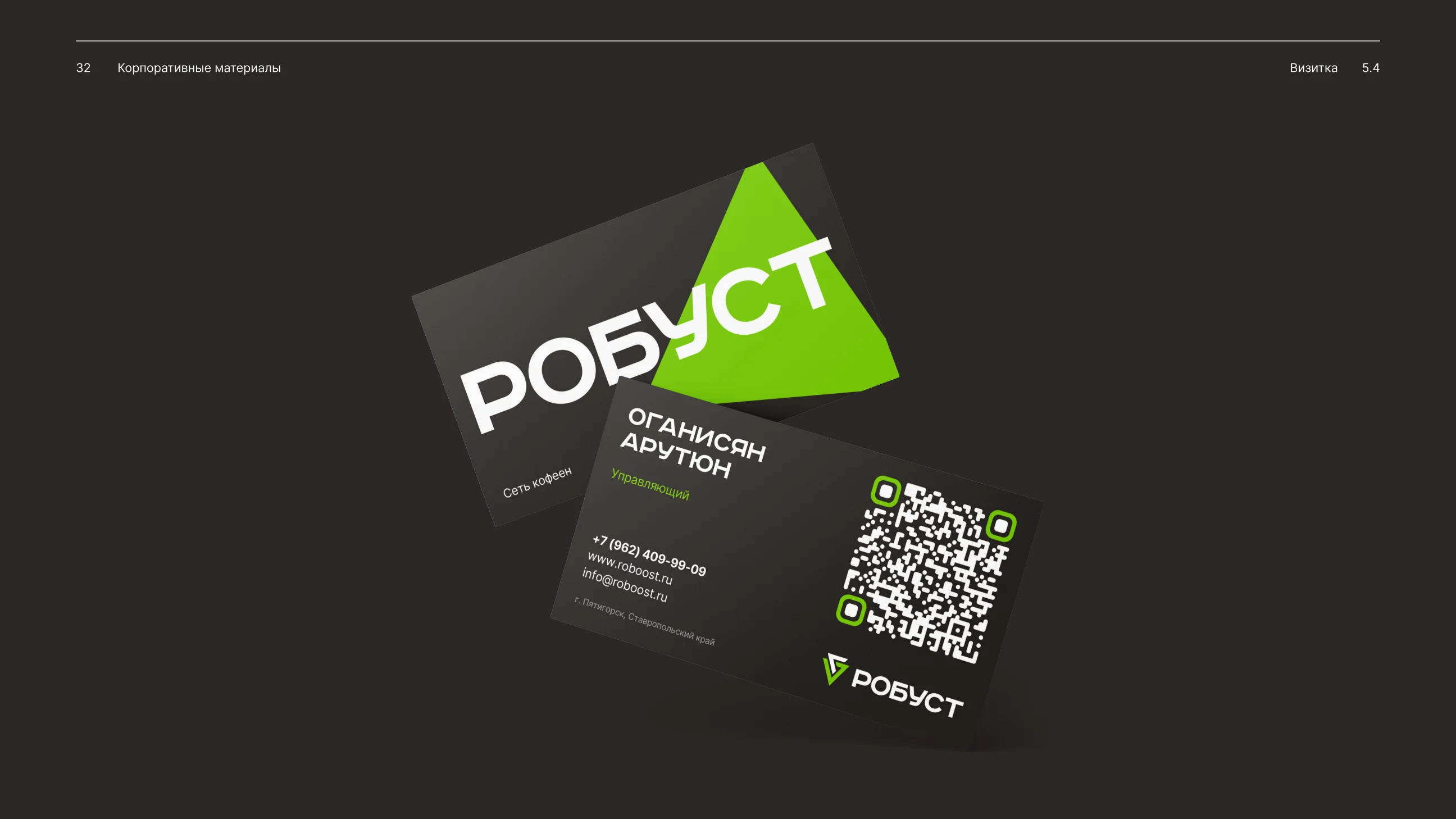
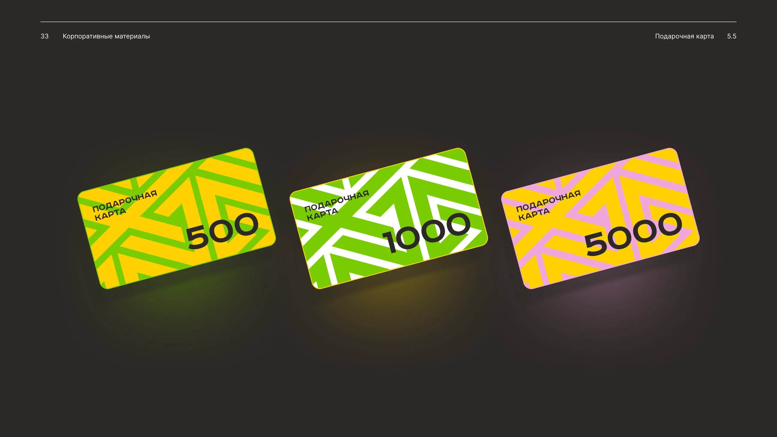
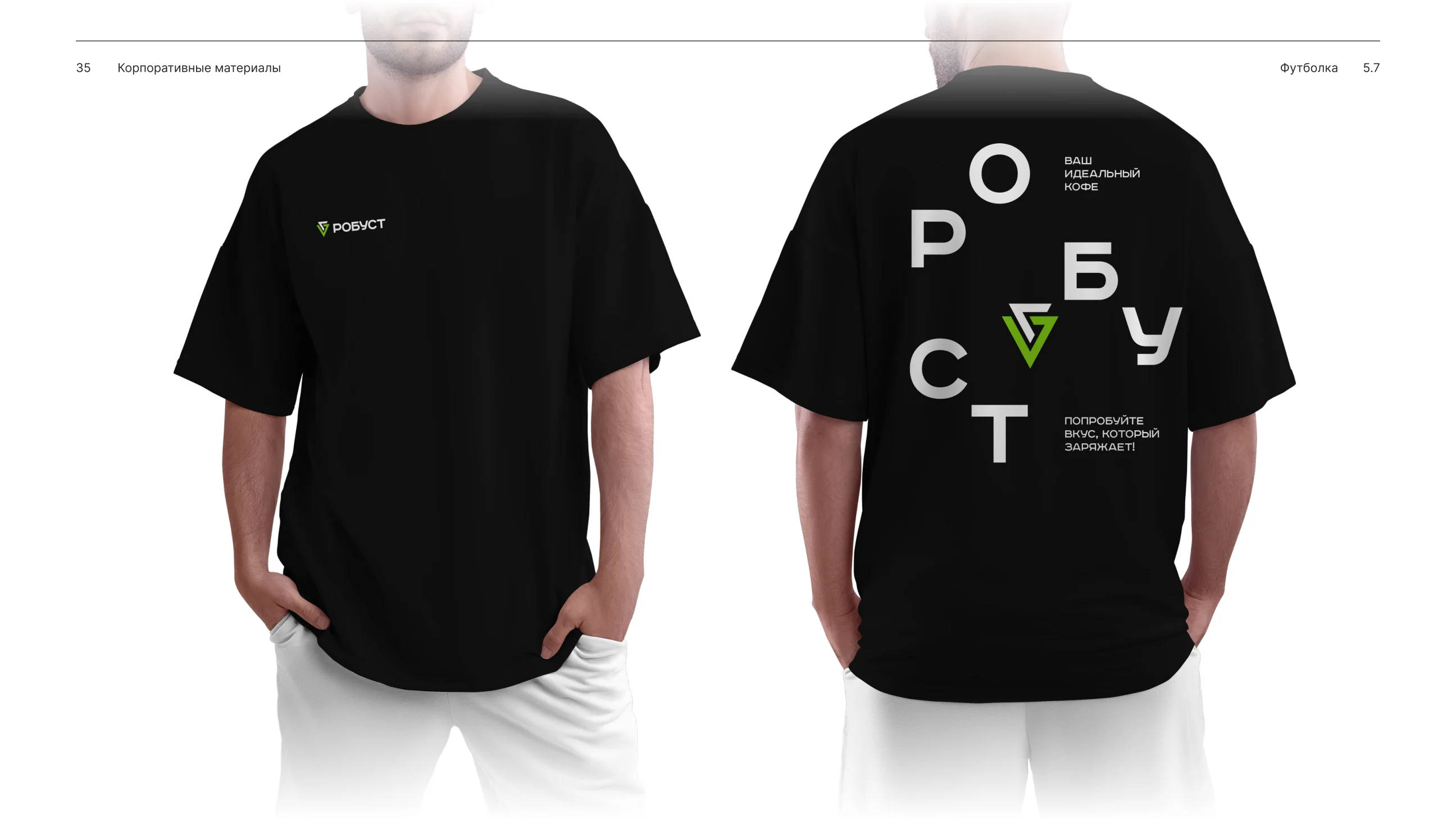
The system scales across coffee packs, cup holders, letterheads, business cards, gift cards, cup stickers and apparel.